Current web site: www.paradiseyogurt.com
(Frozen Yogurt Shop)
The main goal was to significantly improve the user experience. To
reach our goal we implemented the following stages of the design
process:
- Needs Analysis and Content Audit
- Created user persona profiles
- Competitive analysis of three market competitors
- Developed a site map
- Performed card sorts and reverse card sorts
- Analyzed card sort results by creating a Standardization Grid
- Defined user flow
- Created low, middle and high-fidelity prototypes of webpages
This project was completed as a group class assignment of the
Front End Web Development Certificate Program.
NEEDS ANALYSIS & CONTENT AUDIT
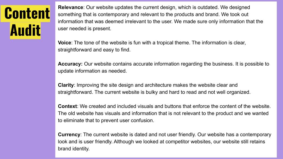
Needs analysis and content audit is research that is done in order
to reveal major problems. Performing deep research is a key stage
in finding solutions and creating an effective design.
The current site is dated, poorly designed, and not user-friendly.
Desired Outcome: An aesthetically pleasing website that is easy to
navigate. Something that accurately portrays the brand, a
tropical-themed “dessert” oasis.
Voice and Tone: Fun and cheerful yet direct and informative.
User Persona Profile
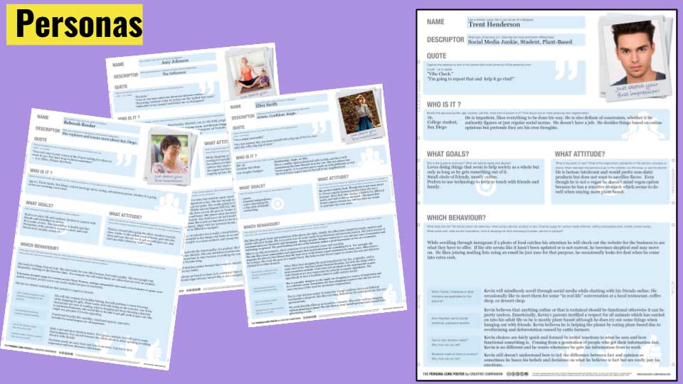
A user persona is a fictional character created to represent a
user type that might use the website. During the design process,
it's important to refer to the user persona with the purpose of
satisfying that customer’s needs.
Frozen yogurt has a broad consumer base, therefore we created four
potential persona profiles. Some UX specialists recommend only
having one or two personas to focus on the specific target
audience. This eases the designers' decision-making process. After
creating various personas we narrowed our focus to one user
profile.
Competitors
We analyzed three competitors websites:
- Menchies.com
- Yogurtland.com
- Pinkberry.com
All three sites were very similar in design and tone with few
variations. The sites were all aesthetically pleasing, responsive,
and fairly easy to navigate.
Competitive Analysis
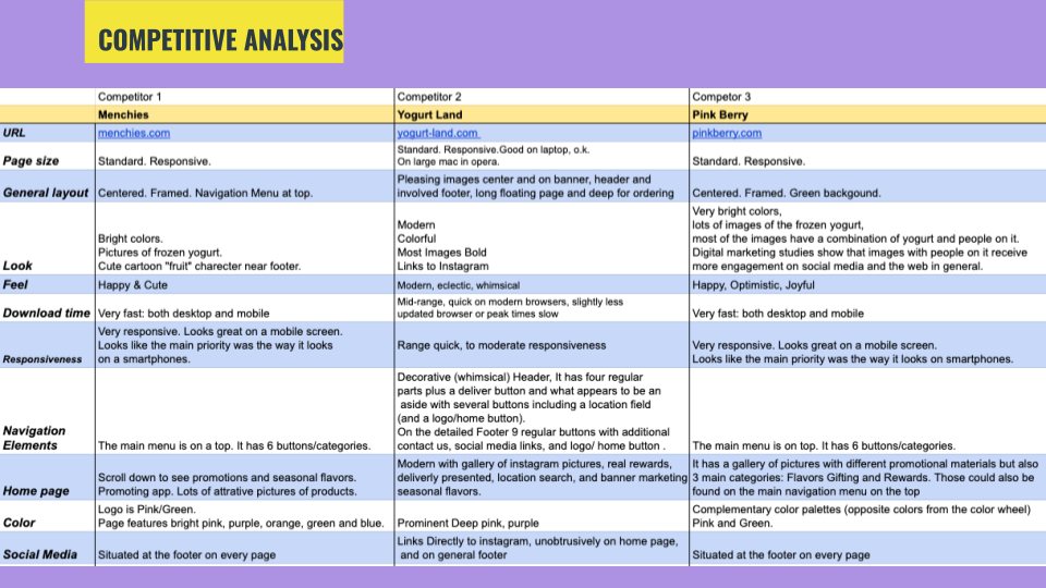
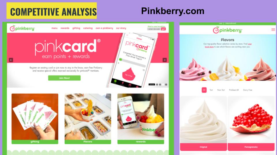
Example of competitors’ features that influenced our website
design.
PINKBERRY:
- Very bright colors, lots of images of the frozen yogurt. Most
images have a combination of yogurt and people. Digital marketing
studies show that images of people receive more engagement on
social media and the web.
- This website anticipates that most of its audience will be on
viewing it on a mobile device and is designed to be
mobile-friendly. Promotional material contains a lot of images of
the mobile screen with a pinkberry.com website on it.
Site Map
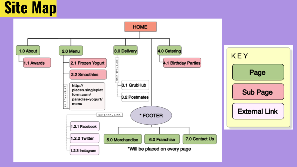
The original website is one long page. Before the card sort was
conducted, we knew that we would have to divide the website into
separate pages.
Our site map separates the contents into logical sections.
CARD SORTING
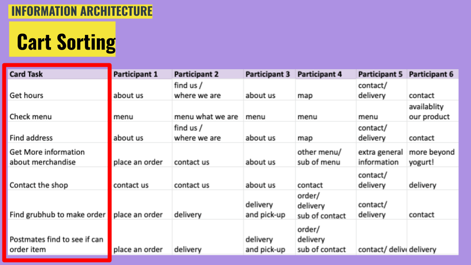
With the purpose of establishing a better user experience, we
asked 6 participants where they would expect to find certain
information located on the website. Below you can find an example
of questions asked and the most popular response:
- "Where do you find hours of operation?"
Most participants chose to put this information under the “about
us” page.
- "Where would you find a GrubHub link to place an order?"
Most participants chose to put this information under “delivery.”
Giving participants these tasks allowed us to determine where the
user expected to find particular information.
Reverse Card Sort & Standardization Grid
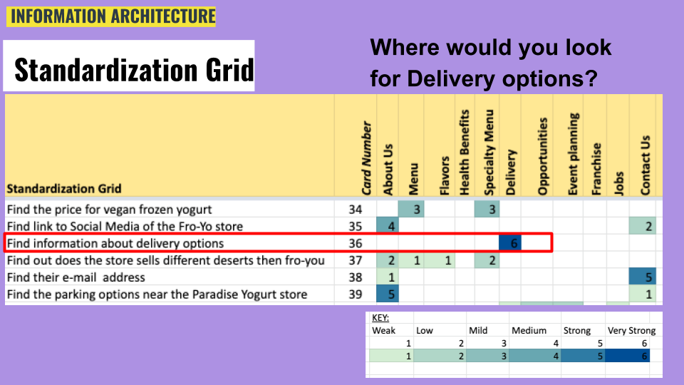
Reverse Card Sort:
- The reverse card sort helped flesh out what we already knew,
that the information needed to be better organized, and that some
content was unnecessary and needed to be removed.
- The reverse card sort prioritized content and determined where
the information needed to be located.
After Cart Sort and Reverse Cart Sort had been performed, the
information we collected was organized into the standardization
grid.
Identifying patterns of users’ behavior improved the site map of
the website.
User Flow
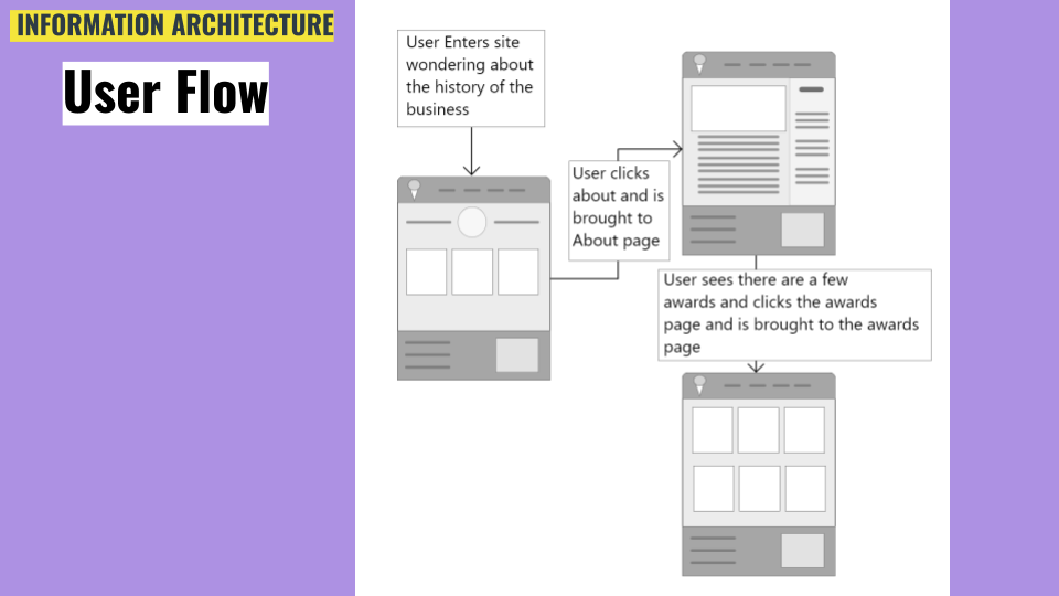
UX flows display the complete path a user takes when using the
website.
The example provided demonstrates how the user reached their goal;
to find the history of the business.
Application used: Adobe XD.
Low Fidelity Prototype
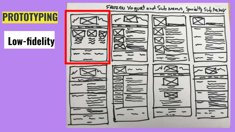
Low fidelity prototype is the first mock-up variation of the
selected web-page layouts.
Creating wireframes as a simple set of sketches allowed us to
agree on the initial position of the elements on a webpage.
After creating several variations, we voted which one we like the
most. Based on that design we created more detailed wireframes and
comps.
MEDIUM FIDELITY Wireframes
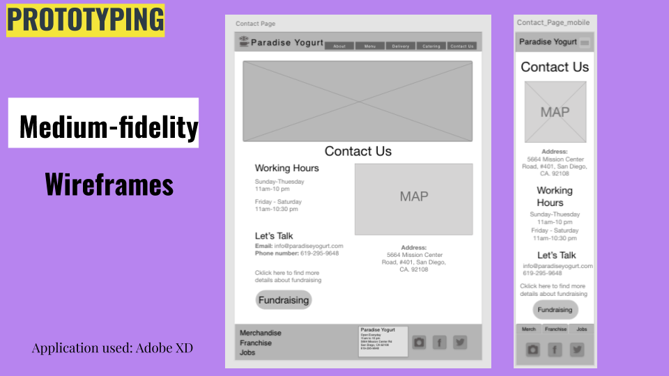
Wireframes are like blueprints in architecture. The purpose is to
communicate the order, structure, layout, navigation, and
organization of content.
It is not used to communicate visual design aspects; such as
imagery, color, or typography.
For that reason, we created simple sketches in black and white.
Application used: Adobe XD.
HIGH FIDELITY COMPS
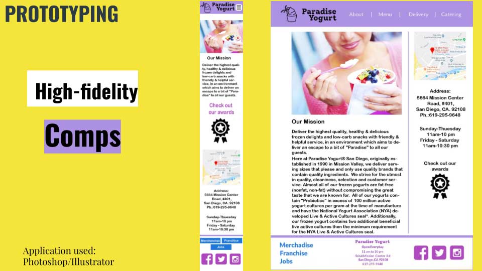
While creating Comps we employed brand consistency and aesthetics
to convert solid wireframes into compelling mockups.
The chosen color palette represents the spirit of a tropical
paradise.
Application used: Adobe Photoshop/Illustrator
Copmare Results
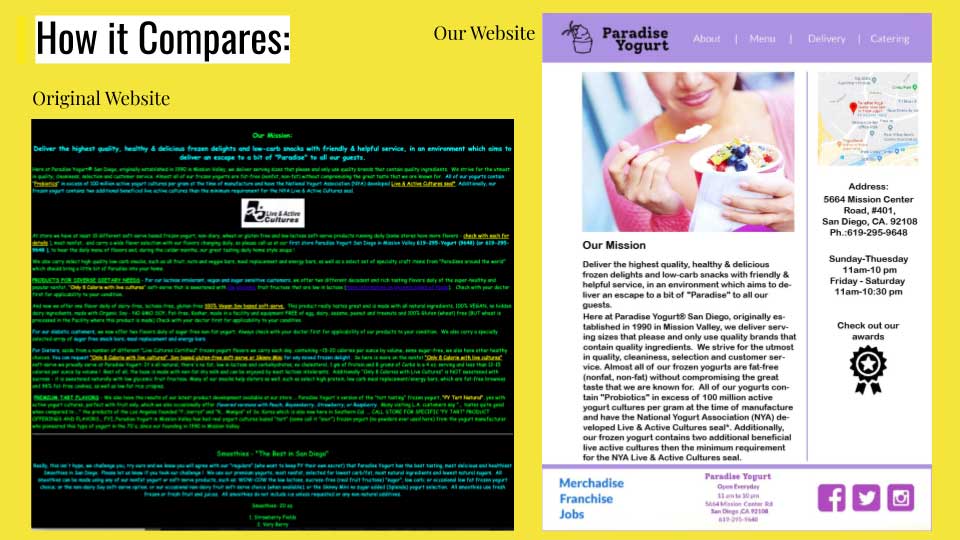
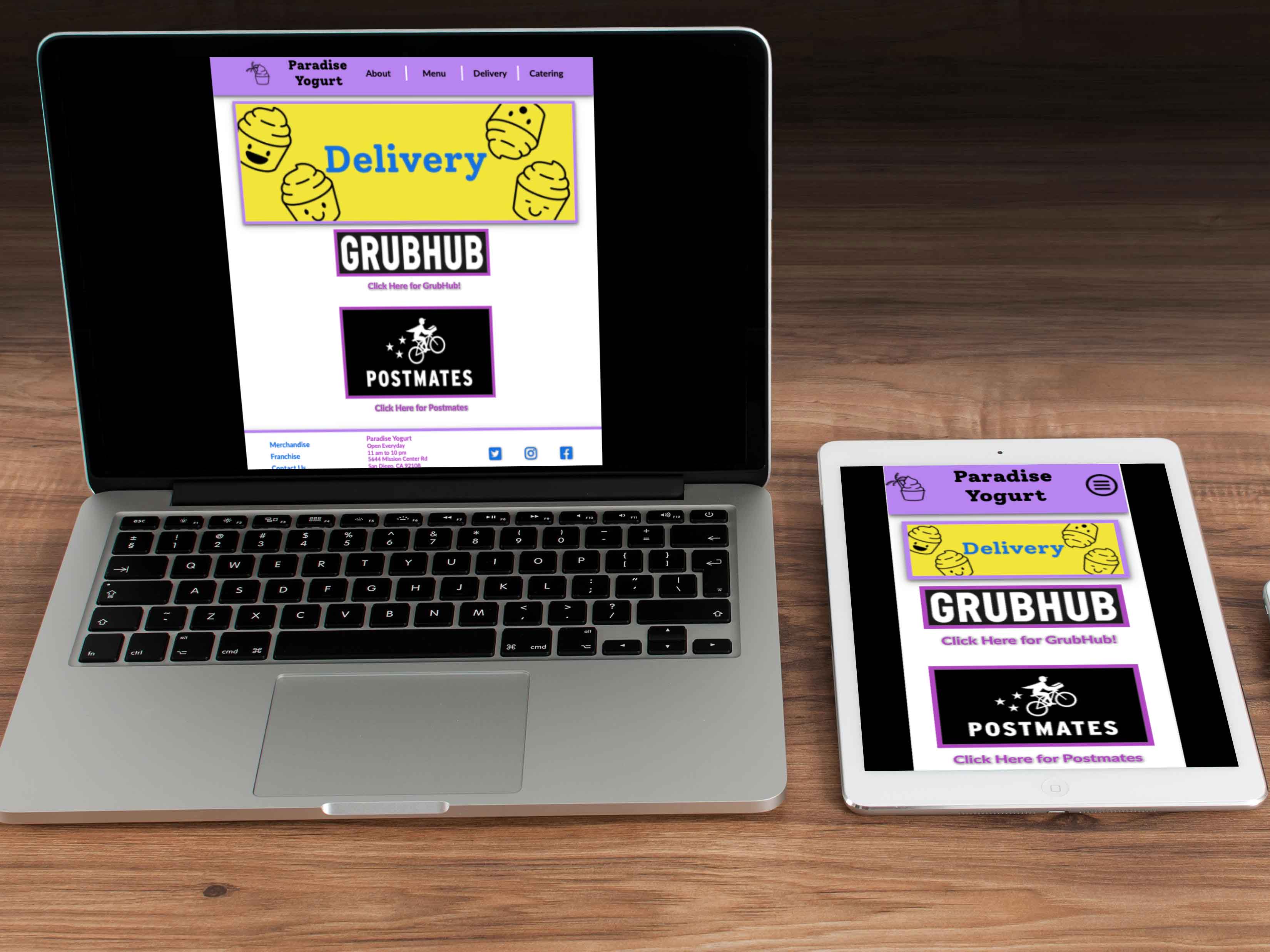
The example pictures demonstrate the differences between the current webpage and the one we designed.
- A simplified menu was created.
- The header links to About, Menu, Delivery, Catering.
- The menu has sub-categories: Frozen Yogurt, Smoothies, Frozen Pies, etc.
- Delivery leads to external links; Grubhub and Postmates.
- The footer links to Merchandise, Franchise, and Jobs.
- This architecture has more sections than the original website; which is one bulky, hard to navigate webpage. We decided to create uniformed pages so the information is easy to find and read.
- etc.
A / B testing
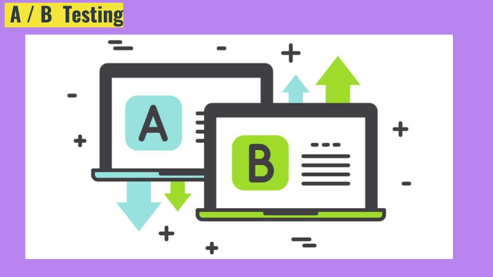
For the scope of this particular UX project, creating Comps was a
final stage.
To make this digital product even more attractive and
user-friendly, the next stage was implementing A/B testing.
Developing a product based on the results of A/B testing increases
targeted actions, conversion, and profits.